Sunday 24 November 2013
Evaluation Of Intentions
For this project I really liked my work. I really enjoyed working in a new way. Fashion for me was never an option and I would always say no. However I am really glad I pushed myself through the barrier of saying no and explored a new world as I think this is in which direction I would like to carry on the course. I learnt so much from Pinterest, Fashion Designers, Fashion Illustration and I have a brief knowledge into the different fashion weeks of the year. Embroidery is 100% for me however I think if I had managed my time better I would have been able to explore other textile worlds a little for example Print. I really wanted to have my images and prints blown up large and digitally printed onto fabric and then me embellish over them, unfortunately time caught up with me. I really enjoyed learning new techniques on photoshop, new machines and new detailing for fashion, for example zips. I personally think I could have done alot some sampling if i had managed my time better. My work compared to last year has improved so much and I think all of the technique classes at uni have helped push my work more. I feel like I have in this project found a new style in which i work well and comfortably. First year for me was a blur and I didnt really have a direction to go in. Second year so far has been so much more intense and helpful.
Tuesday 22 October 2013
INTENTIONS
Urban Environments
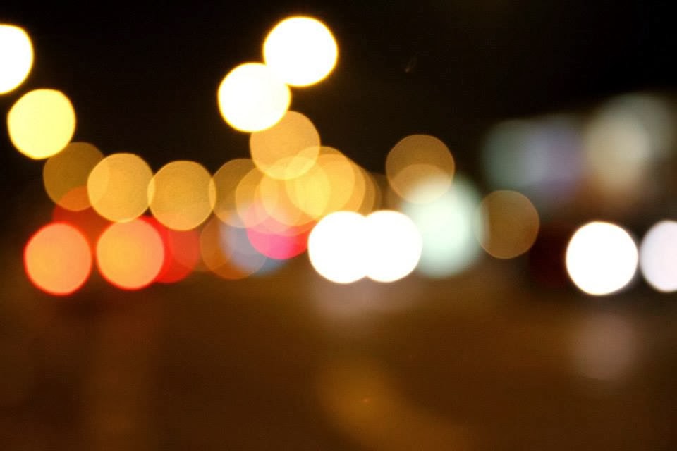
To stars this project off I have started by taking photos at night of differnet lights and differnet illuminous objects in the environment. I took photos in Newcastle, Manchester, Blackpool and a few in London.
I wanted to capture the urban environment in a bright way during the night aposed to during the day when things can all seem dull and have more of an dark urban colour scheme. My main inspiration firstly came from when I went to visit Blackpool Illuminations at the start of October.
New Castle, Manchester, London;


For help with these photo graphs I worked with a family friend who is a working Architech in London. I wanted my photos to come acorss professional and I also wanted to have someone elses in input into the photography as normally it isnt one of my strong points. However I love how these photos have turned out.
Starting off point: Blackpool


From my photos of blackpool I really want to pick up on the colours that the illuminations were showing.
Ink Drawings;

The only material I could think of bright enough to create images of blackpool was drawing ink

Using an abstract way of painting I picked up on the colours and the forms of the light of the illuminations with creating shapes that I can see in the photograph. I purposly left alot of the black background out to see how well the colours stood out

I again used ink to develop from the first ink drawing. I then worked into this more by using acrylic paints and then I added small bits of glitter to liven the drawing.

I started this normal painting of blackpool using acrylic paints however I didnt enjoy working in this strict way. Also painting Blackpool in the day I found the colours wernt interesting me enough.

I then went back to working how I was before and used thick indian ink to create and base then worked ontop with acrylic paints in a small controlled way only using the bright colours I saw. This one differs from the other samples due to the way it has more of a form and resembles the photo more.

Larger ink developments, in a strickt rectangle. I like this way of working of trapping the colour and keeping the idea restrited to a certain space.
Sampling;
For my first samples I wanted to carry on with the idea from my Summer Project of heavy embelishing. I wanted to used beads and jewels to create the blackpool landscape.
I started with a basic calico fabric in an embroidery hoop and selected beads that were involved in the Blackpool photos.

Intergrating small bits of hand embroidery;
French Knots

Developing further..

Finished sample. Creating this took 2 hours but I really like working in this small embelished way.
From the way Im working I really want to work in a fashion context.. maybe looking into designers and current fashions for SS14 that are concentrating on heavy embelishment and embroidery like myself.
Development of colours for mood boards;

Photoshop
I have taken it upon myself to start using photoshop, with a few help from tutorials online, in uni and on the photoshop app Im slowly getting to grips with how it works..

This image is a mirrored image of my embroidery beaded sample of blackpool. I love the way it creates a new pattern and gives that small sample a more fashion based idea. It also helped show me in which way my work could develop for example this patteren repeated everywhere on a heavy embelished garnment.
Designers
-
TOM FORD SS14

I loved Tom Ford's SS14 collection. The materials used to create the pieces relates well to my work. I love the use of mirrored fabric to create an illumiated look. Also the way the garments look to be collaged.

This dress by Emilio Pucci is amazing due to the heavy embelishment. I love the way it looks so much like grafitti and also has an elegant feel to the dress due to the choice of small beads.
This helps me in a way of creating a fabric for a garnment. Would I use multiple repeated meblished patterns? Would I repeat the same pattern all over? Would I want something a little less embelished?

Louise Gray interested me due to the way her garnments keep with the outragious colourful collage feel. Her garnments look like walking moodboards which I love and her choice of frabics that drape well with the outfit. The choice of colour involved is also one of the key facters in this aswel.
Mary Katrantzou SS14

I love the embroidered dress by Mary Katrantzou. The bright summery colours look lovely together and I also like the idea of how there are small detailed patches of embelishement using other materials that are identically repeated around the dress and then two long embelished panels at either side of the dress. The choice of colour for this however is the key part in why I like it. Using to bold colours is just as eye catching as every single colour from my images.

This dress caught my eye during fashion week due to the choice of abstract colours.
I really want to develop this idea of concentrating in a small section, zooming in and reprinting then distorting and again re printing.
COLOUR CONTROL
picking out colours;
Current Ideas.. How to develop.
Shape.
From images of lights at night and the beading sample I really like the idea of condensing things into a small area. I think to develop I have to have a base to go off not just colour so im going to try and push things forward with the idea of shape. The shape that occurs alot throughout my work so far is circles. If its not the circles from the focus on the lense of the camera of lights, its the circle shape of the beads.
Circles


##
Colour
From the colours I have used to far I used ink to splash them all onto paper. This helped me by having most of the colours on one board infront of me. I did multiple pages of these however some didnt work very well due to the dark colours running into each other.

I then put the colours into circles. Selecting certain images and using ink again to recreate them. This gave me again more to work from and helped me think of new ideas for embroidering. From Fiona's drawing workshop I had more fun creating these as I did them outside and took inspiration from us having a day drawing remembering things don't have to be as strict.

I needed to develop my fashion knowledge as this is the route i want to go.
choosing fashion was a risk for me as i had no idea how the fashion industry worked.
I started off using magazines such as vogue and elle to look into upcoming fashions trends and colours. After selecting all of these i then put them into a mood board.
this helped me again so much as I felt all of my work was connecting.

I needed to keep developing my ideas of fashion so i used Pinterest to look into designers LFW & PFW


##
MACHINE TECHNIQUES

Sampling.
Using influences from Louise Gray SS14, my current colour selections I made two samples using found objects that showed the colours well. However I feel that these two samples arnt fashion they are more craft based.

#
Fashion Illustration.
One main aspect of the project is to put my work into context and to help myself develop I decided to look into fashion illustrations using images I have taken and development using ink.


#


Developed Samples

Using mixed media and chosen colours.

Vogue inspiration giving me more ideas about sampling and choosing where to embroider.
#
image maker
Having never used print before I decided I would use the prints I had previously made and experiment with my new fabrics.
The first attempt

Image maker leaves a glue like layer on the top of the fabric so I decided to see if the washing machine would remove this or ruin the whole sample.. It took out most of the colour and left it unrecognizable
2nd attempt.

Being more gentle when removing the glue I manages to get more colour into the fabric..
Final sample ideas I want to develop these image maker samples by doing more and embroidering into them.
I also want to do contrasting final samples with the same mixed media technique just to show a mix of final outcomes to my project.
Final samples
I created 7 final samples
3 mixed media and 4 image maker and embellished.


Subscribe to:
Posts (Atom)